In today’s digital age, information is subject to interpretation by a vast and diverse audience. Journalists utilize tools such as pie charts to provide a more comprehensive picture of the news to enhance understanding. Below, we explore the significant role of the pie chart in data journalism and how it helps make complex information more accessible.
The Role of Pie Charts in Data Journalism

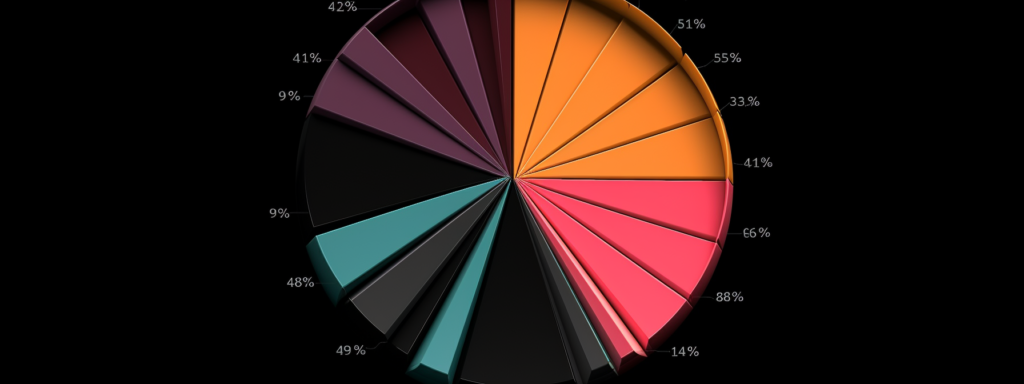
Within data journalism, pie charts provide a valuable tool for representing proportional or percentage-based data. They are widely used due to their simplicity and ease of interpretation by a broad audience. A pie chart compares parts of a whole within a single category.
Also Read: Unlocking the Power of Conversational AI-Human Hybrid Chatbots
Furthermore, pie charts allow for immediate visual comparison, rendering abstract numbers and percentages into tangible visuals. This benefits audiences in comprehending complex numerical representations, aiding in news dissemination.
Since pie charts are preferable for categorical data comparison, they often excel in representing data such as population distribution, allocation of resources, or election results. Delivering such information succinctly and effectively is indispensable in data journalism.
Enhancing Storytelling Through Pie Charts Visualization
Pie charts possess the power to enhance storytelling by conveying complex narratives through simple visuals. A well-crafted pie chart encapsulates vast amounts of data into a solitary image, reducing complex narratives into tangible, comprehensive storylines.
It’s known that humans are inherently visual creatures. Consequently, visual tools such as pie charts can significantly increase a story’s impact, making the narrative more accessible to the reader.
Moreover, pie charts can also serve as the impetus for revealing hidden storylines within the data. With variation in the distribution of data sections, a pie chart may indicate disparities that could lead to insightful journalistic investigations.
Of course, the ultimate effectiveness of pie charts in enhancing storytelling relies on their accurate construction and careful interpretation. Misuse could potentially create distorted perceptions of the data or story at hand.
Understanding How Pie Charts Contribute to Data Interpretation
Pie charts visually interpret complex or extensive data, facilitating understanding for journalists and their audiences. By transforming numerical data into visual representations, pie charts can present trends, patterns, and insights more effectively than text or numbers alone.
The ability to identify connections and disparities between different data sections is greatly increased when pie charts are utilized. They can highlight disproportionality or inequality, highlighting critical issues that may go unnoticed in conventional numerical data.
Further, in an era where reader attention spans are decreasing, pie charts can quickly communicate essential facts and figures, helping readers grasp the gist of the story without requiring them to delve into exhaustive details.
Limitations and Strengths of Pie Charts in Visual Storytelling

While pie charts offer many advantages in data journalism, they also have limitations. Primarily, they are only best fitting for data that can be consolidated into categorical proportions. Attempting to represent complex multi-dimensional data in a pie chart frequently results in an inaccurate or misleading portrayal.
Another limitation is in the visual interpretation. Pie charts can be less effective when comparing multiple categories or tracking changes over time. Likewise, ‘slicing’ a pie chart too thinly may make it difficult to compare slices, leading to interpretation errors.
Also Read: What 5 Advertising Trends Are Changing The Way We Promote?
Despite these limitations, pie charts hold significant strength in their simplicity and ability to translate complex data sets. This easy-to-understand format enhances accessibility, bridging the gap between data-rich stories and a general audience.
Pie charts represent a classic tool within data journalism, remaining widely utilized despite the advent of newer data representation tools. When used correctly, they bolster the effectiveness of visual storytelling and contribute greatly to the overall narrative.


